I made two more layouts inspired by Shimelle's challenges. The first layout is for challenge 10 that said - scrapbook 2 photos on a bold background. I used two pictures from Lila's birthday celebration at preschool back in 2001. I could also use them for the crappy photos challenges - the pictures are not perfect but they are the only ones I have so I treasure them in all their imperfection. I picked a busy background paper from S.E.I. birthday collection. In the larger photo Lila holds a piece of cake, the cupcake paper looked like a good fit. I did what I usually do when I have a bold background paper - I muted it down with vellum. I used 3 squares, each one smaller that the previous. To hold them in place I used an adhesive in the middle, behind the pictures and I stitched in the corners with decorative stitches. The pink flower was once attached to a hair accessory.

Supplies: patterned paper and diecut shapes(SEI), vellum (Recollections), letter stickers (Bella Blvd.), embroidery floss (K&Co), pearl (Making Memories), chipboard (Heidi Grace)
I added letter stickers for the title and a chipboard number 3. I had another photo from the same day and I already scrapped it few years ago. You can see the layout in this post.

The next layout was made for challenge 11 - mix two contrasting patterns to create your background.
I started with baby blue glittery paper by My Mind's Eye and brown lined paper by Little Yellow Bicycle. I mixed both collections for the rest of the layout, pulling piece that work together.

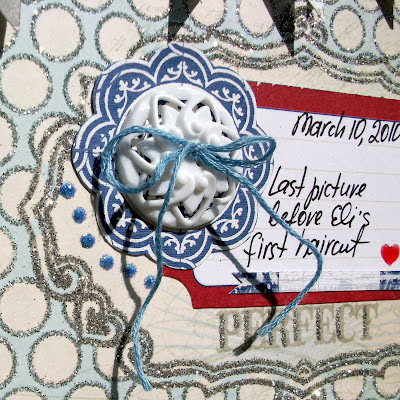
Supplies: patterned paper (My Minds Eye, Little Yellow Bicycle), transparent shapes (Little Yellow Bicycle), layered embellishment (My Mind's Eye), distress stickles (Ranger Ink), faux brads (Heidi Grace), journaling card (Jenni Bowlin), ticket tag (Little Yellow Bicycle), button (Jenni Bowlin), embroidery floss (K&Co), acrylic heart sticker (Cloud 9), twine, staples
I added distressed stickles to the transparent shape by Little Yellow Bicycle. I like how it helps to draw attention to that part of the layout and to Eli's face (did you notice how long was his hair?) and how it works together with the glittery MME paper and the embellishment.

The little blue circles that looks like brads are stickers by Heidi Grace for Colorbok. I bought them at Jo-Ann. Aren't they cute?

I saved this piece of twine (or is it a rope?) from a gift packaging. It worked perfect with this layered banner.


Great layouts Maya. Love all the details in the second one.
ReplyDeleteThat cupcake layout is definitely a bold background!! I love how you used it though... it looks great!
ReplyDeleteYour second layout is great too! I love the pennants and details of it!!
I love your layouts-that second one especially. And, I've noticed that you often scrap old photos. That's so great. i should remember to try that once in a while.
ReplyDeletethe vellum was an excellent solution to the bold background - great idea!
ReplyDeletefabulous LOs Maya! love the close up photo for seeing all your wonderful details!! gorgeous!
ReplyDelete